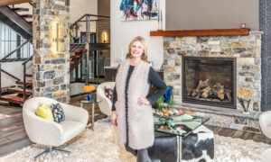
By Maria Bosak
Photos by Hillary Ehlen, Paul Flessland & M. Schleif Photography
Let’s get this out in the open right now. I’m not a designer. I’m a simple farm girl from South Dakota who used to have a kitchen full of bird houses and a short love affair with all-things-chicken (roosters really).
I did not go to school for design (I’m a social worker by trade). I fell into an industry I didn’t know existed and then grew it into a successful business, because it became my passion. I love houses, but more importantly, I love homes. Homes tell a story, feel warm and fuzzy and embrace you upon arrival. Have you ever walked into a home and just felt “it?” That feeling of order (even in chaos) and, more importantly, the feeling that this home is special and the people who live here LOVE here.
Now you may be wondering what all that gushy mushy stuff about homes has to do with this issue’s topic of high contrast design. Well it doesn’t. Not really. Yet, it can.
I’m often asked about the latest trends and styles in home design, and truthfully, I don’t know. I mean “I know” because I can visually see what is going on in the industry around me, but I don’t focus on it as the basis for design when I go into a space. However, I have found a few themes and design styles that I gravitate towards, not because they are trendy, but because I enjoy how they look. I find them timeless, clean and easy to decorate.
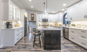
The palette I’m drawn to is a high contrast black and white base. Not only does it appeal to my design taste, but it allows me to easily pivot from a love of roosters to a love of boxwood and linen pillows given the season or my mood.
Let me take you through a few rooms in my own home and shop to give you a look at the way you could work this simple and clean palette into your own home and then transition it as you wish, but maybe forgo the roosters. Let them stay in 1995–although that was a GREAT year.
The Girls’ Guest Bedroom & Guest Bath


Okay, I will admit the floor in the girls’ guest bathroom is a bit trendy. I’m ok with that—I fell in love with it and it makes me smile every time I walk into the room. That is maybe the most important lesson in design. It’s YOUR house (not your neighbors, not your MIL’s, not your Bunco group’s). Do what makes you smile. Also, the floor is small in this room. If I decide I’m tired of the tile, it wouldn’t be a large investment to change it. With a black and white design scheme, I can change both the girls’ bathroom and bedroom to a have new look with a few simple changes.
When I decorated these rooms, they were an homage to my late grandma Caroline. She loved the color pink (I do too) and the accents were placed with an intention to remind me of her. Now, I will admit I’m ready for a change. So, let’s play “what if.” What if I took out all the pink accents, the bench and the flowers and replace them with a new color palette. In the bathroom I could take down the shelves and replace them with an old, wood-toned window or frame and hang a boxwood wreath in the middle, and maybe add a white rug on floor. This would immediately change the feel of the room. The bright green boxwood wreath would become the focal point and change the feel of the room completely. The same goes for the bedroom. Let’s place a wood toned bench at the foot of the bed, add new rustic, wood-toned side tables, a few vases with simple green stems and a few linen-colored pillows on the bed. Can you see it? Same room, new look! More relaxed, less formal and a tish refined rustic and not so “Grandma Caroline.”
I realize that if I had actually made these changes and taken new photos you might enjoy this article better, but hindsight is 20/20 and I’m going to make you use your imagination a little today. This will be a good test in using the Pinterest board in your mind, a little “seeing it” without actually “seeing it”. We are strengthening your design eye.
Let’s try another space. This is fun.


The cabinets and shelves in my shop, Eco Chic Home, are designed to flow with the change of seasons and arrival of new products while complimenting the rest of the store design. The backsplash is a matte finish black kite tile and I used a dark charcoal colored grout. This was intentional to keep the customers’ eyes focused on the products and not cause an uncomfortable distraction between the tile and the actual items on the shelves.
The same can be said for shelves in your home. The backdrop needs to enhance the visual experience and not take away from it. I find a high contrast difference between things that touch creates a visually stimulating design. In this case, the items on the shelves are the focal point, not the tile, so our team places items here that pop off the tile. Now this same tile was used by my friend Brandi in her home, but she used white grout. The contrast between tile and grout creates a visually stimulating focal point in her kitchen. In this case, the tile became a gorgeous focal point, not the items around it.
CAPTION OF CORNER WITH PLANTS Brandi’s backsplash
As you walk through my home, this re-occurring theme of black and white contrast flows from room to room with a few touches of cedar and brick to bring texture and dimension. I find it calming, consistent and simple. I give you this advice, don’t overthink your design. A few tricks of working with contrast along with adding personal touches will give you a home that hugs and fits you (and the pages of Pinterest) perfectly….but mostly you.
Cheers to home,
Maria
Eco Chic