Photos by Hillary Ehlen
WHO SAID TRADITIONAL IS BORING?
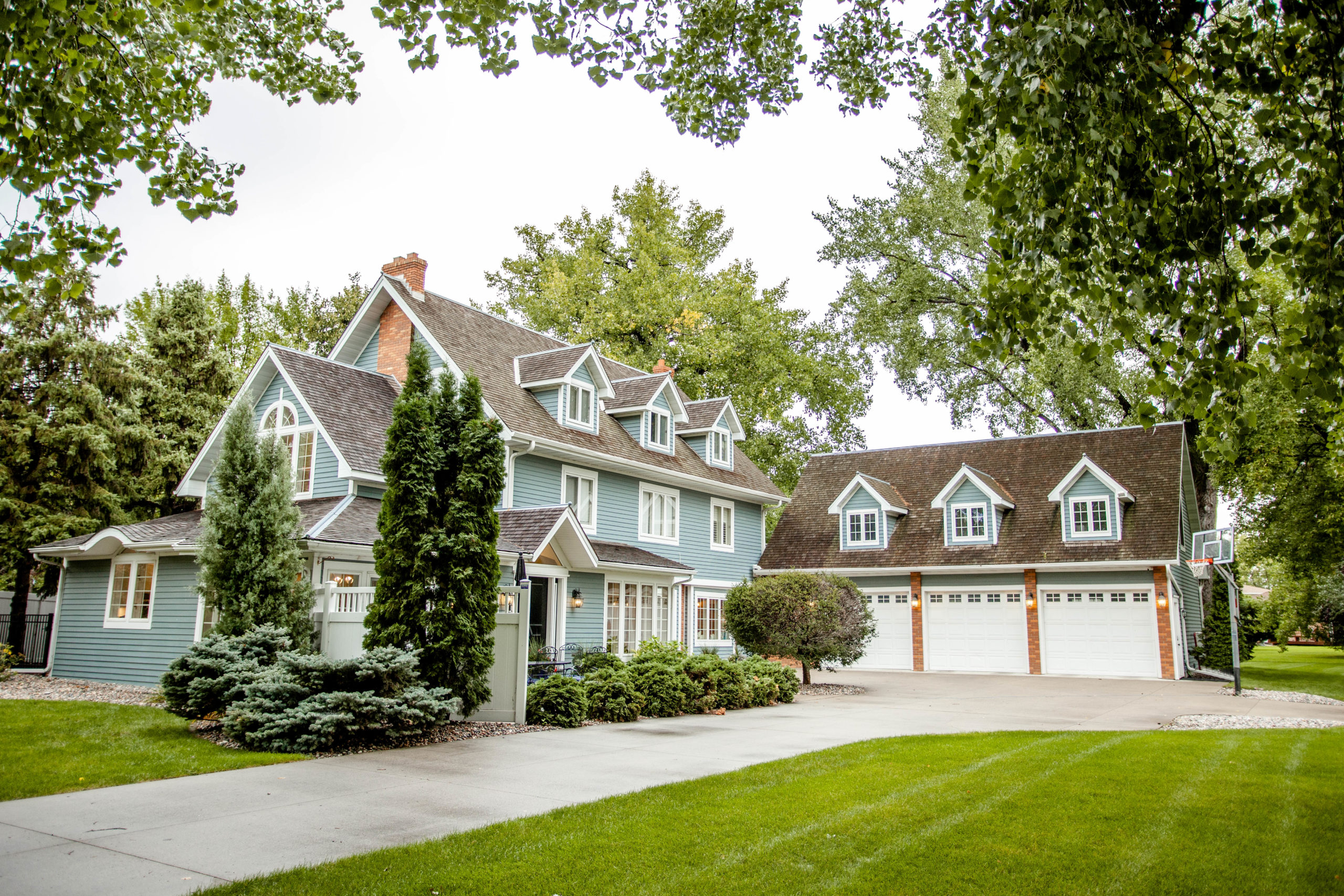
Coined “The Doll House” by neighbors, lies a charming home, nestled into an established Fargo neighborhood. This nickname is not surprising once you get a look at its exterior. This beautiful home was the original homestead that its development was built around, and with the Christen Joy treatment, it was ready to once again be the main attraction of the neighborhood.
After purchasing the home, my clients immediately brought me over (even before the kiddos!). Fun fact, the family felt blessed to snag this home as it’s never been on the market! I instantly fell in love with the character of the home, its traditional nature and the opportunity to accentuate that character while layering in contemporary design elements that would create a fresh feel for my clients.
With the main floor as the focused area for this refresh, I advised a plan of what recommendations I had – from floor to ceiling. This encompassed the casual and formal dining rooms, kitchen, living room and powder room.
A year ago we embarked on the remodel and refresh of this home and, now, I’m beyond excited to open the doors of The Doll House to share with you just what went on over the last 12 months! Come on in…


WELCOME IN
The exterior needed very little work, as you can see (swoon!) To still give it some attention, we freshened up the entry with new sidelights and a new, black door that is the perfect complement to the powder blue home with its beautifully aged cedar shake roof.
As you enter, the most noticeable change was minimizing the size of the pillar that broke up the kitchen from the casual dining area, and was a visual break from the entryway to the kitchen. The pillar previously housed a push-in cabinetry TV and intercom system, but the new owners preferred for an open feel instead. With the family having resources to determine quickly and easily what we could remove and what needed to stay, demo started literally during a FaceTime call one night as they told me they were moving forward. The, now, minimally-sized support pillar blends in and allows guests and owners to enjoy an open look and feel.
The perfect bench with antique stain and cane was anchored by a new wall sconce that was selected for functionality for guests arriving or leaving. Beadboard and concrete – cast like brick – were additional layers of the home that we loved and wanted to keep. By freshening them up with a coat of the perfect shade of paint, this was easily achieved. The cherry on top? A unique piece of artwork to welcome guests in…more to come on that.


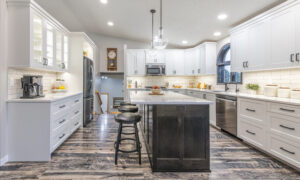
THE HEART OF THE HOME
The layout of the kitchen was already perfect, so we opted to add functionality to the space to make it a better fit for the busy family. We also layered in design elements that were both timeless yet fresh, as became a theme for the whole house.
For this project, I looped in the one and only Kaeli Wendt of Wendt Custom Cabinets. Y’all know by now that they’re my favorite, because they deliver top- notch product and design. We discussed my ideas and brainstormed more, eventually landing on moving the island to be a single-level and extending its size. This allowed for more seating, prep space and workspace (hello, future working from home and virtual school space). On the kitchen perimeter, we replaced glass doors and side décor shelves with solid doors and the perfect width cabinetry to remove any shelf styling needs. We also shifted the Sub-Zero fridge/freezer down to allow for more countertop space and a corner that was more well-rounded.
In some homes, I love a bright white cabinet, but with the traditional nature of this home, I wanted a traditional white kitchen but in a shade that wasn’t too stark or yellow. We landed on White Dove BM OC 17. This was also the shade used on the freshly painted doors and the new trim work (we updated all trim throughout the main floor for more consistency).
Christen Joy Tip: Feel free to layer in the same shade throughout your home, but use different sheens for different areas. I like to use eggshell on walls, flat on ceilings and semi-gloss on doors and trim. The higher the sheen, the lighter it will feel and semi-gloss is also more traditional.
For the countertops, we opted for a white Quartz with hints of veining. This veining was further extracted by pairing it with a complementary 3 x 6 greige subway tile backsplash. The jewelry of the room? A bridge faucet in polished nickel and large antique brass pendants to anchor the island. I also love how this space has so many symmetrical features – it really brings a peaceful feeling to the space! Finishing touches on the heart of the home included French bistro styled countertop stools, in both back and backless variations. The stools’ white and gray palette add texture and an overall light and fresh vibe. Further light accessorizing added functionality and personality.


THE FORMAL DINING ROOM
The formal dining room was refreshed with a new, matte black, linear lantern chandelier to echo the existing large, lantern found at the tip-top of the home, near the top of the staircase. A buffet to house extra hosting elements from glasses to napkins was purchased and later styled with traditional blue and white chinoiserie vases and greenery. To finish the space, we added a gilded mirror to echo the brass accents in other spaces.
Christen Joy Tip:Love this look? Head to your local HomeGoods to snag these vases ranging from $20-75! Add a seasonal dimension by incorperating appropriate greenery.


THE “CASUAL” DINING AREA
I once took a friend to an L.A. lobster house for sunset views and she said, “I thought you said this was casual?” “Correct,” I said looking up from the wine list. So this is my dear readers is the casual dining area.
The previous homeowners had papered the dining space and I loved how that created a unique space, while still open within the floor plan. We took this open and wallpapered idea and continued the blue and white look in this space, all the way up to the statement light fixture. We replaced the previously tan wallcoverings with a deep, navy grasscloth – framing the gridded windows beautifully, creating contrast and interest.
A perfect-sized rug became the shoulders that the textured chairs and bleached oak table sat on. Understated while the star of the show, a plaster white single tier chandelier with large, tulip stems housing the bulbs became a true piece of artwork for the space.
Christen Joy Tip:When looking for light fixtures for a vaulted or sloped ceiling, check the details of your fixture to make sure it is compatible with your ceilings. If you’re unsure, call the manufacturer to ask before clicking “add to cart!”


LIVING ROOM
During that initial walkthrough, the previous homeowner’s furniture was still in place and my client asked what I thought of the green velvet sofa. I loved it and she later told me she purchased it. This vibrant green became a centerpiece for the living room’s playful, but classic feel. The space was planned to be a more formal space, as there was a bonus space for the kids elsewhere. However, it wasn’t to feel overly formal.
One of the biggest decisions in this space was opting to extend into it the rich, hardwood floors that were running elsewhere in the home. Tollefson’s Flooring provided guidance to ensure the floors would flow effortlessly in the space – feeling as if they were underneath the carpet all along. This and the previously mentioned cohesive trim work really created a space that flowed and was much needed, as the home had been added on to throughout the decades.
Open bookshelves and an antique fireplace surround were removed for what was to come. Wendt assisted with new custom built-ins, which I envisioned being storage for games and “un-styled” storage needs in the solid, doored cabinets below. The above area would be a space for family photos, interesting objects and pops of vibrant greenery. Clear glass and lighting on the upper-half were used to ensure the styled space could shine day or night.


A custom fireplace surround modernized the space while basketweave tile ensured the traditional taste of the home was not lost. Keeping the space formal, but with flexibility – we opted for a TV that is also artwork. With a dark and sophisticated frame, this piece of technology is a TV when it’s on, and art when it’s off. The owners can select the same piece displayed or showcase whatever fits the mood. It’s versatile and completely up to them!
Furniture and upholstery work were selected for comfort and practicality. Leather, tufted chairs are paired with an ottoman with acrylic legs and a deep, navy shagreen coffee table. Marble nesting tables layer in elegance and tradition while the functionality of the tables can float throughout the space.
Bench cushions on the window seats were reupholstered and topped with flanking pillows. Brass, library sconces now overlook the benches – after a minor “surgery” on the concrete walls and ceiling to make it happen.


NOT-SO-BASIC POWDER ROOM
The powder room was once a cream color I can only assume begging to be outfitted in something, shall we say, a bit more lively!
As I take you into the powder room, this wallpaper may be familiar, as you were introduced to it at the beginning of this article as the unique artwork at the entryway. With paper this fabulous, we opted to frame it and hang it as artwork. The paper, Citrus Garden, is from the Schumacher archives of 1947. Both whimsical and warm, this paper is the perfect balance of contemporary flavor and traditional roots – no pun intended.
Christen Joy Tip:The powder bathroom is a space that can have more “personality.” Smaller in size, you can create a “wow-factor” through paper, linens, artwork or lighting. Go ahead and play a bit – I promise guests will ooh-and-ahh over it!
I asked my talented installers to make the paper’s tree imagery the focal point as you walk in. Though it seems like no big feat, the paper is extremely delicate and you must consider the width and the size of the room. They did an amazing job which people for years will get to admire.
Keeping the existing vanity, countertop and floor, we refreshed the lighting, added a large, walnut mirror and accessories and let the wallpaper speak for itself.


Whether you’ve purchased a home traditional in nature or you love the aesthetic of traditional elements blended with contemporary pieces – embrace and enjoy it. Nobody ever said traditional needs to be boring – just ask The Doll House.
The Magic Makers
Cabinetry & Countertop Dream Team –Wendt Custom Cabinets
Flooring & Tile Wizards – Tollefson’s Contract Flooring
Paint & Wallpaper Super Stars – Gene’s Paint & Decorating
Electrical Geniuses – Axis Electric
Contractor Needs: The Muscle & Brains –Signature Improvements
Upholstery Guru – Recovery Room Upholstery
HVAC Magic Makers – Element Mechanical
–

LIVE CHRISTEN JOY
Facebook.com/LiveChristenJoy
Instagram.com/LiveChristenJoy
Anderson is a Minnesota native with an eye for decor and design. Christen Joy specializes in new-construction commercial projects, exceptional remodels, furnishing high-end living spaces and creating memorable special events. Anderson is also a passionate art collector, world traveler and home cook who frequently entertains for friends.
Join me on Instagram and Facebook to see my latest projects and email me at [email protected] for project inquiries.
Read more from Christen Anderson here.